La Mer Re-Brand
Throughout the semester I built a design system for the skincare brand La Mer that focuses on luxury minimalism. I used a modern geometric font for copy, and I created a custom stencil logotype.
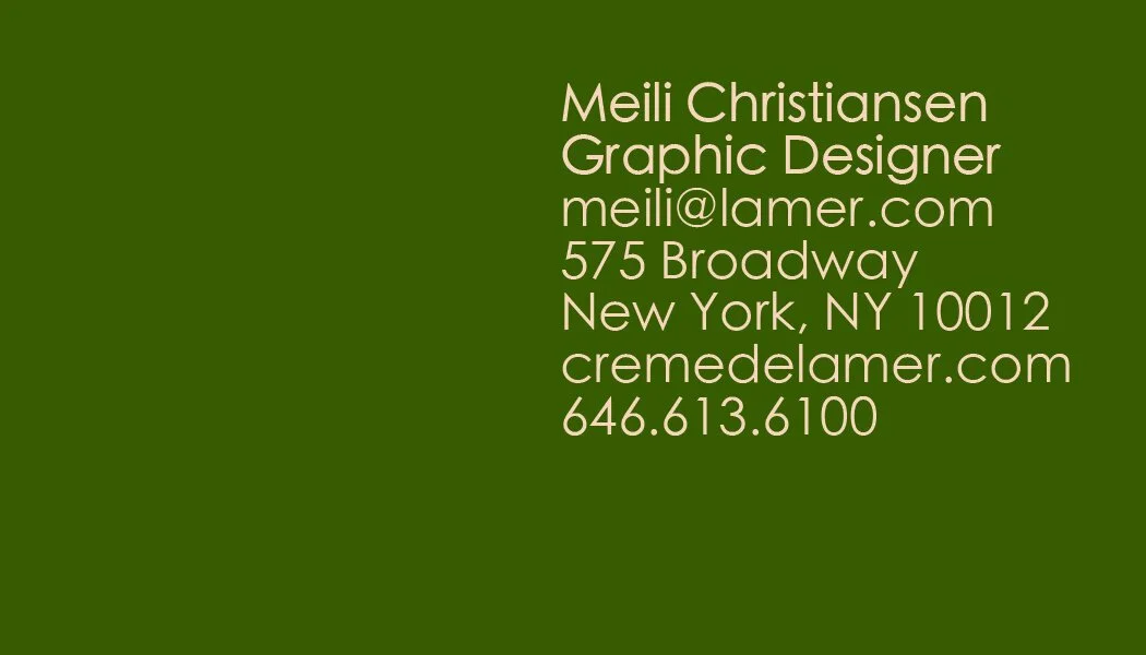
Business Card
I created a grid system for print and digital design that is based on the concept of reflecting the logotype and copy across the grid lines.
Letterhead
I continued to develop the branding based on the grid system.
Website
I created mockups of existing La Mer products with the new logotype. The website will scroll horizontally with the navigation set in the top left corner of the page.
Packaging
Using the die-lines shown above, I printed packaging for The Moisturizing Soft Lotion and The Eye Concentrate. Both sizes of packaging feature a watercolor seaweed interior box, and a dual-tone sleeve.
Posters
The posters showcase a proposed pop-up shop in Chicago on Navy Pier. The poster on the right presents the logotype in a dark navy color, differing from the standard green and cream color ways for the first time. However, the poster says within the same design system by only using two colors, and keeping the logotype and secondary font consistent.


